Analytics
Visualize your spending patterns with interactive charts. Filter by time period and currency, drill down into details, and get AI-powered insights to understand your finances better.
Overview
The Analytics tab provides a comprehensive view of your spending through charts, insights, and data exploration. All data is based on your expenses in the selected account.
Time Range & Filters
At the top of the Analytics screen:
- Time range toggle: Week | Month | Year
- Currency filter: All currencies, or select a specific one (USD, EUR, PLN, etc.)
The selected range affects all charts and insights below.
Summary Cards
- Total Spent — your total expenses for the selected period
- vs. last period — “more than last week/month/year” or “less than last week/month/year” with percentage
- vs. 3-month average — shown below the period comparison once you have at least 1 prior full month of data, e.g. “18% above 3-month avg” (green = below average, red = above average)
- Avg per Day — average daily spending
AI Insights Carousel
A horizontal scrollable carousel of AI-generated insights (Pro plan required):
- Spending Anomalies — unusual spending detected (e.g., “78% more than usual on Transport”)
- Budget Predictions — when your budget is projected to run out
- Savings Opportunities — suggestions for reducing spending
- Category Comparisons — how your spending compares across categories
- Trend Changes — significant shifts in spending patterns
Each insight card has severity: critical (red), warning (yellow), or info (blue).
Note: Free plan users see a prompt to upgrade: “Upgrade to Pro for AI insights.”
Charts
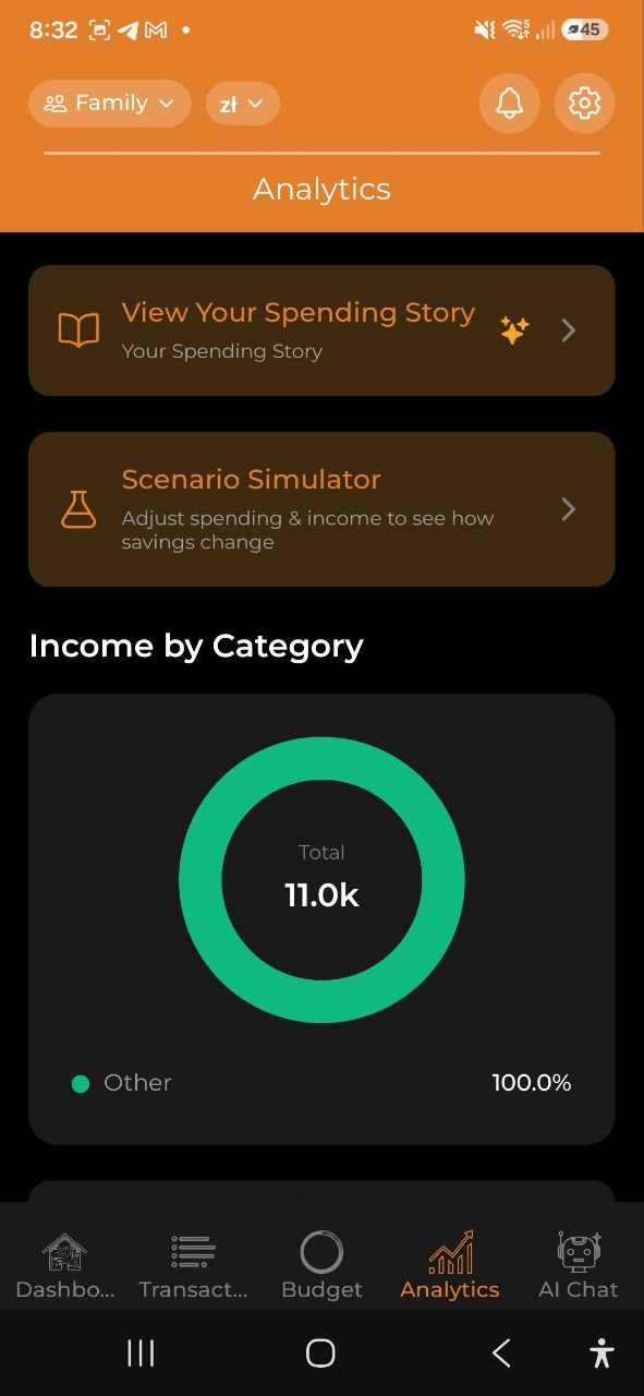
Income by Category (Donut Chart)
- Breaks down your income by category for the selected period
- Shows only when you have income entries with categories (e.g., Salary, Freelance, Dividends, Rental)
- Color-coded in a green/teal palette to distinguish from expense charts
- Uncategorized income is grouped as “Other”
- Appears above the spending trend chart
Spending Trend (Bar Chart)
- Shows daily or monthly spending over the selected period
- Interactive: tap any bar to drill down into that time segment
Spending by Category (Donut Chart)
- Category breakdown with percentages
- Color-coded by category
- Tap a slice to explore that category’s expenses
Budget vs Actual (Grouped Bar Chart)
- Side-by-side comparison of budget limits vs. actual spending
- Shows On Track or Over Budget per category
- Only appears if you have active budgets
Spending by Day of Week (Weekday Chart)
- Pattern analysis showing which days you spend the most
- Insight: “You spend the most on Saturdays”
By Merchants
- Top merchants where you spent money in the selected period
- Shows up to 8 individual merchants; the rest are grouped as “Other”
- Only appears when at least one expense has a merchant value
If the same shop appears under several names, open Settings → Merchants to tidy them up: tap Select, tick the variants, and Merge them into one name. The app also suggests likely groups (for example several Biedronka entries) that you can merge in a single tap — so they count as one merchant in these charts.
By Tags / By Projects
- Tag Breakdown — spending grouped by your custom tags
- Project Comparison — spending grouped by projects
- Helps track themed spending (e.g., all #coffee expenses or “Vacation” project costs)
Drill-Down
Tap any chart element to explore deeper:
- Year view — tap a month bar to zoom into that month
- Month view — tap a week to zoom into that week
- Week view — tap a day to see daily transactions
- Day view — see individual transactions
Use the Back button to navigate up through levels.
Quick Insights
Below the charts, you’ll find text-based quick insights:
- Top Category — your highest spending category this period
- Peak Spending Day — the day with the most spending
- Daily Budget Tip — recommended daily spending to stay on track
- Receipt Savings — total amount saved from discounts
Top Receipt Items
A table showing your most frequently purchased receipt items: - Item name - Total spent - Number of purchases
Export
Tap Export Report to open the Export & Reports screen where you can generate PDF, Excel, and CSV reports, view monthly digests, and manage data backups.
FAQ
-
Q: Why don’t I see any charts? A: Charts appear after you have expense data. Add some expenses first, then check Analytics.
-
Q: How are AI insights generated? A: Insights are generated by analyzing your spending patterns, comparing with historical data, and identifying anomalies. This requires a Pro or Business subscription.
See also: Budgets | Spending Story | Export & Reports